

Page Contents
A moodboard session often begins with a clear goal and ends with a folder of unrelated images. Each new prompt introduces another style, so the client reacts to novelty instead of choosing a direction. A better use of Nano Banana AI is a three-round experiment. Every round answers one decision, narrows the brief, and produces a smaller set for the next conversation.
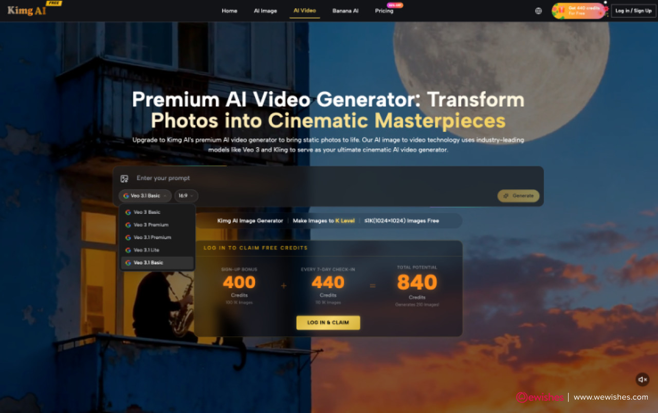
The number of available options is the trap. Kimg AI can return one to four images per request in several ratios from text or a reference, so a meeting can expand faster than it decides. The success measure is not how many looks the team generates. It is whether the final board gives production a usable rule for color, composition, subject, and tone.
Define One Decision for Each Moodboard Step
Write the three decisions before opening the generator. Round one selects the visual territory. Round two selects the composition and palette within that territory. Round three checks whether the direction works across the actual assets the project needs. If a round cannot be stated as a decision, it will probably expand the brief instead of narrowing it.
Round One Tests the Visual Territory
Create three or four deliberately different directions from the same audience, message, and subject. Differences should be easy to name, such as documentary photography, clean studio still life, warm editorial collage, or graphic illustration. Do not ask for tiny variations yet. The client is choosing a territory, so the options need clear distance without changing the strategic brief.
Read also: Cyberbullying: Tips For Teens And Parents To Deal With It
Round Two Narrows Color and Composition
Take the selected territory and test two composition rules plus two palette rules. Keep the subject and message stable. For example, compare centered product framing with an off-center layout that leaves room for copy, then compare a restrained brand palette with one approved seasonal accent. This turns feedback into a small set of choices rather than another request to make it pop.
Round Three Builds the Review Set
Apply the chosen rules to the real formats: perhaps a wide hero, a square tile, and a vertical story. Use the image-size control for those destinations. The objective is not perfect final art. It is evidence that the direction survives different crops and content types. If it works only in one cinematic frame, production needs to know before the style is approved.
|
Round |
Decision |
Output kept |
|
One |
Choose one visual territory |
One direction plus rejection reasons |
|
Two |
Choose composition and palette rules |
Two or three written rules |
|
Three |
Check the rules across real formats |
Compact production board |
Rejection reasons are part of the output. They stop a discarded style from returning in a later round under a different prompt. Keep the reasons concrete: too dependent on tiny text, product becomes secondary, palette conflicts with packaging, or vertical crop loses the key action.
Set a time box for each round before the session starts. Twenty focused minutes can be enough to create and label a small comparison; another ten can capture the decision. If the group cannot choose, write down the missing information rather than generating blindly. The blocker may be audience research, brand guidance, or a product fact that Kimg AI cannot resolve from visual exploration.
Use the Workspace Without Expanding the Brief
The interface can create several images quickly, which makes discipline more important. Fix the brief fields that should not move: audience, communication goal, subject, and channel. Change only the variable assigned to the current round. When a promising accident appears, save it to a parking lot rather than letting it rewrite the active decision.
Read also: A Better Way to Revise Lyrics: Listen Before You Rewrite Everything
Set One Ratio for Fair Comparison
During the first two rounds, use one representative ratio for every option. A wide cinematic frame can make one style look stronger than a square layout even when the difference comes from the canvas. Hold the ratio constant, then test destination sizes in round three. Fair comparison requires the options to solve the same spatial problem.
Keep Each Batch Small and Labeled
Use the Number of Images control to create a small batch, not an endless stream. Label outputs with round, direction, and version. A four-image request is useful when all four explore the same decision. It becomes noise when every image has a different subject, palette, lens, and layout. Reviewers should be able to explain what changed without reading the prompt history.
Move to Nano Banana Pro when the selected direction needs more complex composition, accurate text, or a higher-resolution proof. Do not use the premium route as a substitute for choosing. A more polished set can make indecision harder to see because every option begins to look presentation-ready.
Read also: Beyond the Prompt: Engineering Predictability in Generative Video Pipelines
Run a Client Review That Produces Direction
Present the board in pairs or small groups that answer the round's question. Start by restating what is fixed and what the client is choosing. Avoid a wall of twenty images. Large grids reward whichever thumbnail is loudest, while a structured comparison helps the client connect preference to a repeatable design rule.
Give the reviewer a neutral option to say that neither direction answers the brief, but require a reason tied to the agreed goal. This prevents forced approval while keeping the discussion useful. If both options fail because the product is hard to recognize, the next round should repair subject treatment rather than introduce a third unrelated style.
Ask Comparative Questions Instead of Ratings
Ask which option makes the product easiest to identify, which leaves useful room for copy, or which tone fits the audience's expected level of formality. Do not ask everyone to rate images from one to ten. A rating expresses preference without explaining what production should repeat. Comparative questions produce reasons the creative team can use.
Write the Chosen Rule Before Regenerating
End each round by writing the decision in plain language. For example: use warm natural light, keep the subject off-center with open space on the left, and avoid tiny environmental props. Get agreement on that sentence before generating again. Kimg AI then tests the rule rather than asking the client to rediscover the same preference in a fresh set.
-
Keep audience, message, subject, and channel fixed.
-
Change only the variable assigned to the current round.
-
Show small comparable sets with named differences.
-
Record rejection reasons and the selected rule.
-
Stop exploration when the board can guide production.
Stop When the Board Can Guide Production
This three-round method fits agencies, in-house teams, and independent designers who need client alignment before investing in finished assets. It gives generation a clear role: producing evidence for a decision. It does not ask the client to become an art director through endless reactions.
A successful moodboard is not the largest or most polished one. It is the smallest board that tells the next maker what to repeat and what to avoid. Once the color, composition, subject, and tone rules survive real formats, stop prompting and begin production. More options after that point are usually a new brief, not better research.









Comments
No comments yet — be the first to share your thoughts.